Have you ever wondered which focal lengths you tend to shoot? If you use fixed/prime lenses then maybe it’s a moot point but for us zoom users it’s a question I’ve been wondering about for myself, so I decided to interrogate my Lightroom catalog to find the answer!
I was also looking to prove whether my stated technique of ‘only using my zoom lens at set/prime lengths’ was true in real life. I try to do this myself so that a) I get used to the type of shots I am taking - their perspective and the feeling they give and b) avoid the tempting trap of standing still and zooming - which completely changes your photograph in a twist of the wrist but is not the same as moving your feet to get a better composition.
So what I was looking for was to generate a graph from my Lightroom catalog of the most used/popular focal lengths, anticipating peaks at 24, 35, 50, 70, 85 mm etc (i.e. the lens marking points and also popular prime lens choices).
I started by doing a download of my Lightroom catalog metadata (e.g. filename/lens/focal length) using this tool https://www.photographers-toolbox.com/products/lrtransporter.php but quickly realised that I would need to think carefully about which photos I included and excluded. Some things I quickly realised would skew the results:
Mixture of landscape photos (my main subject) plus family / dog / other photos
Photos due to be deleted for poor quality and/or older ones where I had not evolved my style so much
Photos which are essentially duplicates (i.e. long series of shots on a tripod while the light changes / making composition fine adjustments etc)
I managed to partially neutralise point 1 by filtering on my main cameras and lenses only ( I predominantly use just one for each camera), so to exclude a 50 mm lens I use for family & other portraits. I never use it for landscapes. If I was meticulous in tagging photos in Lightroom, then I could just filter on ‘landscape’, but I can’t go back in time and do that!
I managed to mostly mitigate point 2 by using LR star ratings - things with only 2 stars and above. This cut some of the noise out from multiple unrated / unsorted / other photos, although it’s not foolproof.
I have no way of sorting issue 3 without some heavy Excel work to get rid of ‘fuzzy’ duplicate files; however my workflow does mitigate this to some extent, as I routinely go through my shoots and progressively whittle down low rated / duplicate files, leaving just the best ones and maybe a couple of alternative / keepers for future use or even just as backup in case the worst happens and a I lose a RAW.
Anyway, enough of the analysis - here’s what I found;
Here’s which focal lengths I use most
The graph makes for interesting reading (to me anyway) - I was expecting the results at the wide end but not so much at the short telephoto end (60-100 mm). In the middle I was expecting to see, and can confirm, my preference for 50 mm, even having excluded results from my actual 50 mm lens for the reason above. My lens maxes out at 120 mm so it’s not surprising to see a peak out there but I wasn’t expecting it to be so big. There was a lot of action in the short telephoto range, across a variety of lengths, which I can’t explain. Main points I learned:
I really do prefer and stick quite firmly to a 50 mm viewpoint, across thousands of photos
A lot of my landscape work is at 35 mm (also not a surprise) but it goes down to 24 mm more than I thought (my perception is I rarely use wide angles) and lengths in between
I have way more 20 mm shots than I thought (that can only be from my prime lens) - maybe there’s another reason for that, as I rarely get it out
I didn’t think I took much between 70 mm and 120 mm but clearly I do!
I kind of stick to the marked focal points on my 24-120 mm zoom lens but not as much as I thought (even considering sometimes I zoom out slightly to allow for distortion / tilt corrections or print margins)
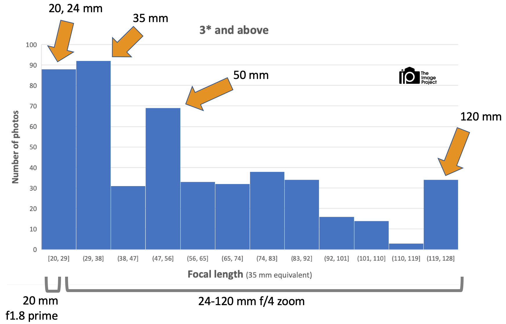
I also decided to run one more graph off, this time filtering out all the 2* images (which for me means things I wouldn’t share on social media or print) and just look at 3* and above. Plus I also made the bar graph bands thicker, to get more of an overall impression of what I shoot. See below:
Focal lengths used but this time only better images and coarser bands
This graph shows that, when you lump things together more coarsely, I take more shots around 20-40 mm combined than I do at 50 mm, which is again a little bit surprising. I also have quite an even spread of shots between 50 and 120 mm. I clearly go for 50 mm when it’s in that kind of zone though!
My conclusion is that I have the right lens for the job (although a longer telephoto would be nice but I don’t want to carry it) and that I could do better to stick to lens markings at the upper end, to understand those perspectives better. And I definitely do prefer 50 mm as a viewpoint but not as much as I thought.
I wonder what it would looked like if I plotted this over time to see how my preference change? Another job for another day!
Hope you enjoyed reading at please let me know what you think (or what you know) your preferences look like!

